These Facebook ads are re-marketing ads for users who have previously landed but not opened a savings account on on our digital marketing savings account landing page.
After having looked at what images and copy performed well in the past, I collaborated with a designer to see what images we could use to capture interest on Facebook. We chose a stock photo, an illustration, and a papercraft image. For papercraft, NerdWallet uses puns per the copy guidelines — that's why the clock image ad uses wordplay. The other copy options tested focused on clear and simple benefit-oriented language. The ads did very well and had a high ROI.
These Pinterest ads were aimed at getting users to take a credit card quiz that would recommend a travel or cash back rewards card. These ads had a high CTR compared to Pinterest ads featured previously.
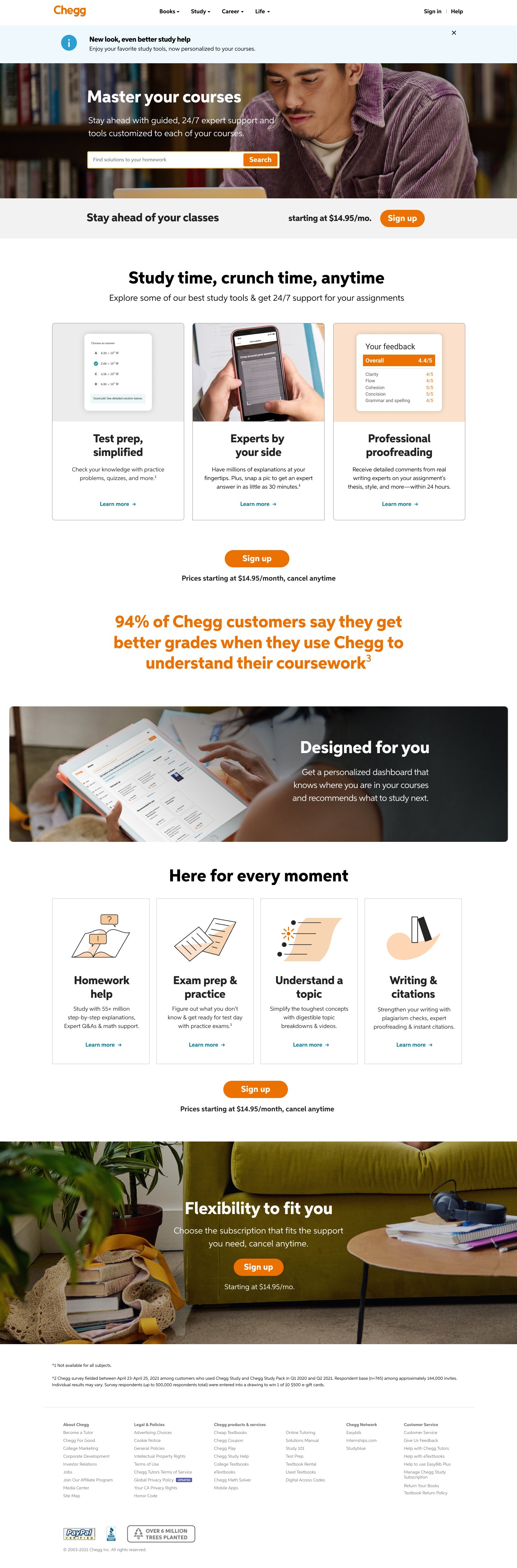
Chegg had a second rebrand Fall of 2021. Titled “Horizon” internally, the brand took a shift towards a more serious and realistic look at student life. Instead of bubbly optimism, the brand now shifted towards the realism and diversity in the student body.
We worked very closely with an agency on the new brand look and feel for the launch. However, when the pages launched I was tasked with not only leading the copy team on the whole rebrand but also leading (for copy) an optimization team that would ultimately increase conversion more than ever before for Chegg’s main study page. These are examples where I wrote a lot of the copy, worked directly with the agency, and lead messaging strategy for the team. At the time, I was also interim copy manager.