

/
1
2
3
·
·
·

Chegg had a second rebrand Fall of 2021. Titled “Horizon” internally, the brand took a shift towards a more serious and realistic look at student life. Instead of bubbly optimism, the brand now moved towards illustrating realism and diversity in the student body.
The creative team worked very closely with an agency and with our internal partners in marketing and UX on the new brand look and feel for the launch. I was tasked with not only leading the copy team on the whole rebrand but also leading (for copy) an optimization team that would ultimately increase conversion more than ever before for Chegg’s main study page. These are examples where I wrote the copy, worked directly with the agency, and led messaging strategy for the team. At the time, I was also interim copy manager.

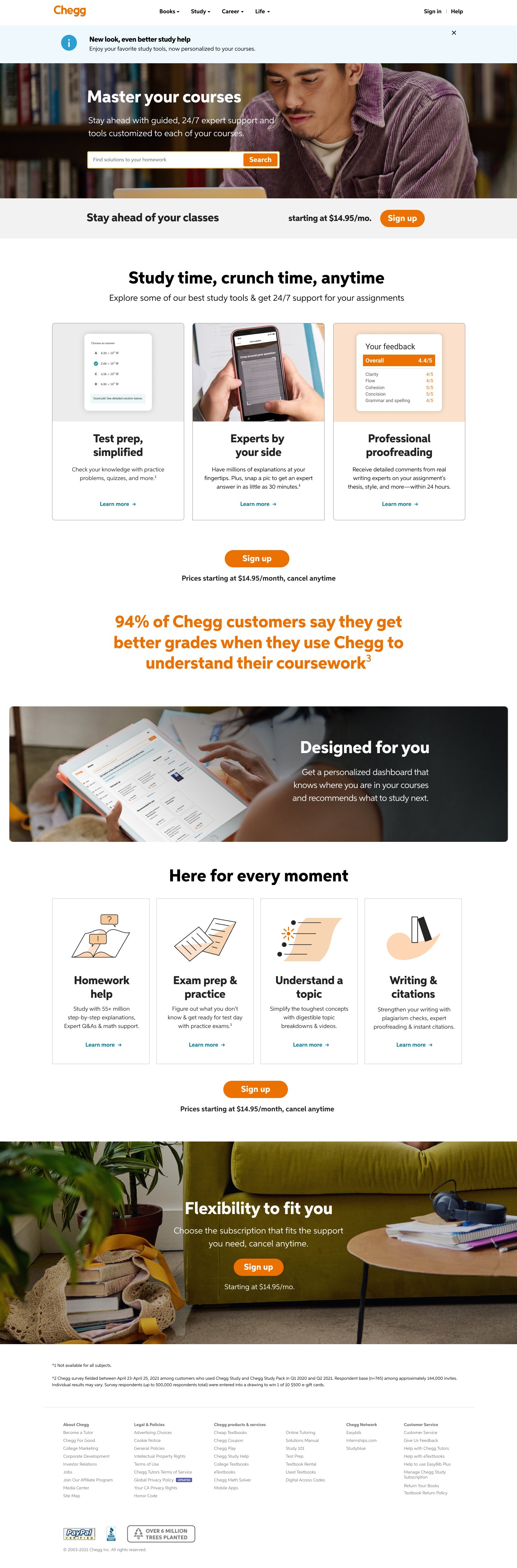
Study LP
This is first featured landing page is the Chegg Study page which us conversion focused, so the copy does speak more to the benefits of the product in more detail. The featured Study page I wrote improved conversion by over 40% for the Study page at the launch of the rebrand.
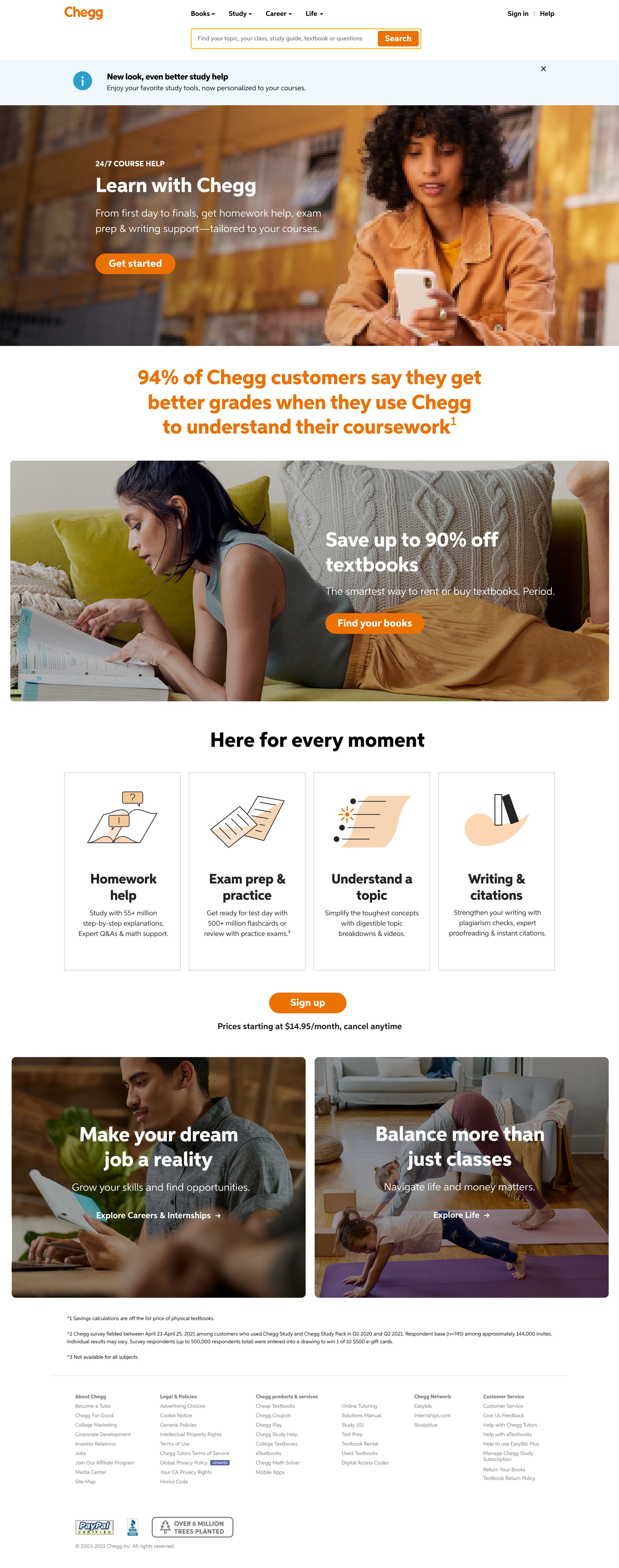
Homepage LP
The second featured landing page is the Chegg signed out homepage which is less trafficked but is still a high-visibility page. This page is still undergoing some optimization A/B tests. You’ll notice some of the modules are similar to the Study page as we test what works. One hypothesis is that this page should be more narrative-focused since it is the homepage and be less focused on actual products. Conversion has improved here as well from before the rebrand, but there is still room for improvement to reach our goals.
With this project, we have many changes in order to keep improving conversion and click through rates using heat maps and qualitative data to help us navigate what we should test next when it comes to copy and design.